Planning a website redesign? Your analytics tell an interesting story - plenty of visitors, but sales aren't following. You've made the usual fixes. New headlines. Fresh photos. Different button styles. But when you're looking at sky-high bounce rates and conversions that barely register, these quick fixes miss the bigger picture.
The truth is, you need a website redesign. And I'm not talking about a new coat of paint. Your business has grown. Your customers have changed. Your website should reflect that growth with a strategic rebuild that puts real results first.
This guide shows you exactly how to nail your website redesign, step by step. No fluff, no filler - just practical steps to turn your website into the sales machine it should be.
What Is a Website Redesign Strategy (And When You Need One)
Picture your website redesign like this: Instead of moving furniture around in a cramped space, you're knocking down walls and rebuilding from the ground up. It's about making smart choices that get visitors to stick around, engage, and take action.
A solid website redesign starts with the basics - how people use your site, what they need to see, and when they need to see it. We look at everything from your site's structure to its speed to its messaging. Every change has one goal: getting more visitors to become customers.
So when is it actually time for a redesign? Here are the real signs your website needs a complete overhaul:
You've Outgrown Your Current Site
Take a good look at your website. Does it still show what your company does today? Or is it stuck showing services you offered two years ago? If someone landed on your site right now, would they get an accurate picture of your business? When your website feels like looking at an old photo, it's costing you real opportunities.
Your Analytics Show People Leaving Fast
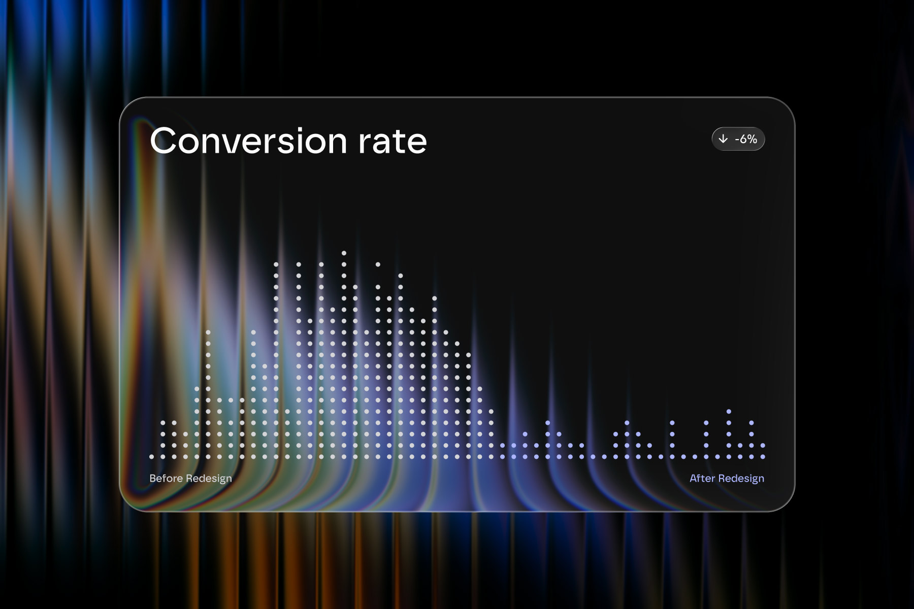
Let's talk numbers. When people hit your site and bounce right off, that's a problem. When they abandon their cart halfway through, that's a problem. When they exit your most important pages without taking action, that's definitely a problem. Here's what we know: If your mobile site takes more than 4 seconds to load, nearly half your visitors will leave. And if your load time jumps from 1 to 3 seconds? Your bounce rate goes up by a third. Those aren't just statistics - that's revenue walking out the door.
Your Conversions Have Hit a Wall
Here's the thing: Traffic isn't enough. If people visit your site but don't take action - whether that's making a purchase, signing up, or reaching out - something's broken. Maybe they can't find what they need. Maybe your forms are too complicated. Maybe your site makes them work too hard. A proper redesign fixes these friction points.
The Competition is Getting Better
Look at your competitors' websites. Really look at them. How easy is it to use their site compared to yours? How smooth is their checkout process? How well do they present their services? If you're being honest with yourself, you might see why potential customers choose them instead of you. A modern, well-designed website isn't just nice to have anymore - it's expected.
Your Mobile Site Is Giving Users Headaches
If your site makes people pinch and zoom just to read text, you've got a problem. If they have to fight with tiny buttons or forms that break on phones, you've got an even bigger problem. And it's not just about annoying your visitors - Google pays attention to mobile performance when ranking sites. Poor mobile design hurts your visibility and makes your business look out of touch.
Let's look at what doesn't work. Take this car rental website as an example. The booking form is squeezed into a space so small that users need surgeon-level precision just to pick a date. The menu is a mess of tiny links, and the main headline disappears into a busy background image. The result? Frustrated users who'll book elsewhere.

On the flip side, look at what works well. Etsy's mobile site feels natural. The text is readable without zooming. The buttons are easy to tap. Product images adjust perfectly to any screen size. Nothing feels crammed or rushed. It's a perfect example of a mobile design that puts users first, and it shows how much of a difference thoughtful mobile design can make.
Planning a Website Redesign: Strategy Before Design
Here's a hard truth about website redesigns - most of them fail before the first pixel is placed. The reason? Everyone wants to jump straight to picking fonts and colors. But that's like choosing curtains before you've built the walls.
Let's talk about what actually needs to happen before design work begins:
Link Your Site to Real Business Goals
Redesigning a website isn't an art project - it's a business move that needs to pay off. Before you do anything else, get specific about what success means:
- What exact business problems will this new site fix?
- What numbers need to change to make this worth the investment?
- How will you know it's working beyond "it looks better now"?
Pro tip: Write down your current stats—leads per month, sales numbers, conversion rates. You'll want to compare these to your new site's performance later.
Get Clear on Your Market Position
Before you touch a single design element, you need to nail down exactly where your business stands. And more importantly - where it's going. Think through:
- How you're positioned in your market right now
- What actually makes your business different
- Who your ideal customers are (and what they care about)
- Where you want your business to be in 2-3 years
Let me share a common issue we see. Companies rush into redesigns, thinking they just need a "modern look." But that's backwards. Your site's look and feel should come from your market position.
Take Intercom as an example. Look at their site. They don't just say "we do customer service." They're crystal clear: they're an AI-first platform.

That positioning shapes everything - from their homepage layout to their feature highlights. They know exactly who they're for: businesses that want to use AI to work smarter.
Know Who's Doing What (And When)
A website redesign needs clear ownership. Nothing slows down a project like confusion over who makes decisions or who creates what. You need to know exactly who's leading the project, who's creating and approving content, and who's handling the technical pieces. Be clear about when you need outside help too - and what exactly you need them for.
Map out your tech requirements while you're at it. Your new site needs to work smoothly with all your existing tools - your CRM, analytics, payment systems, and everything else that keeps your business running.
Spot the Risks Early
Redesigning a website has its danger zones. The key is seeing them coming.
First, know what absolutely can't break. If you're running an online store, your checkout process needs to work perfectly from day one. If you're a SaaS company, your login system can't fail.
Then there's the technical stuff. How will your new site connect with your current tools? What custom features need special attention? Don't forget SEO—a wrong move with URLs or content can tank your search rankings overnight.
Better to deal with these issues in planning than to scramble to fix them after launch.
{{cta-blog-component}}
8-Step Website Redesign Process (2026 Guide)
The difference between a great website redesign and a costly mistake? It's all in the process. After working on hundreds of redesigns, we've refined these steps to focus on what actually moves the needle.
Let's walk through each step, starting with the most critical one:

Step 1: Know Where You Stand
Before you change anything, you need to know exactly what's happening on your current site. Skip this step, and you risk fixing things that aren't broken while missing real problems.
Here's what you need to analyze:
Traffic Patterns: Which pages bring people in? Where do they go next? Where do they leave? These patterns show the real user journey through your site.
User Behavior: Look at time on page, scroll depth, and click patterns. Sometimes tiny details reveal big problems - like people never scrolling past your hero section.
Conversion Performance: Find your money pages - the ones that actually drive business results. Often, your most visited pages aren't your best performers.
Technical Health: Check site speed, mobile responsiveness, and SEO performance. A beautifully designed page means nothing if it takes 10 seconds to load.
Common pitfalls we see:
- Only looking at surface metrics like page views
- Forgetting about mobile performance
- Not having proper tracking set up
- Missing key user segments in your analysis
Need Help With Your Website Analysis?
Website analysis is detailed work. Our team can dig into your site's performance, set up proper tracking, and show you exactly what's working and what isn't. We'll turn complex data into clear action plan for your redesign.
Contact us now to get started with a free website analysis.
Step 2: Setting Clear Goals and KPIs for Your Website Redesign
"We want our website to look better" - we hear this a lot. But here's the thing: a successful redesign isn't about following the latest design trends. It's about moving specific metrics that matter to your business.
Want to know if your redesign was worth the investment? Start with clear, measurable goals. Skip the vague "we need something more modern" and focus on numbers that drive business growth - like increasing qualified leads by 20% or getting users to spend 30% more time on your product pages.
Your business strategy needs to guide these goals. If you're pushing to be the go-to player in your market, your site should showcase your expertise and build trust. More focused on bringing in new customers? Then your design choices should make it incredibly easy for potential clients to understand your value and take action.


Setting Realistic Benchmarks
Start with what you already know. Look at your current website data - it's full of insights about what's working and what isn't. Say your best-performing contact form converts at 3.5% while others struggle at 2%. There's your benchmark - aim to get all forms up to 4%. While industry standards are good to know, your specific situation and data should drive your goals.
Creating an Action Plan
Turn those goals into specific tasks. Want 20% more form submissions? Break it down: redesign your form layout, cut unnecessary fields, and add clear calls-to-action. Set realistic deadlines - maybe two weeks for design concepts and three for development. Get your key people involved - designers, developers, and content writers all need to be on the same page.
Pro tip: Build some flexibility into your timeline. Almost every website redesign uncovers surprises along the way - like outdated plugins that need replacing or mobile layouts that need extra work.
Step 3: Understanding Your Audience for Website Redesign
Your website's success depends on how well it connects with your target audience. While many businesses rush past research, taking time to understand your users will guide better design decisions.
User Behavior Analysis
Study how people currently use your website. Where do they click? What paths do they take? Which pages keep their attention, and where do they drop off? This data shows you what's working and what isn't. For example, if users spend time reading your blog but rarely contact you, you might need to strengthen the connection between your content and calls-to-action.
You access all these insights via Google Analytics. It does more than count visitors. GA maps out the digital footprints your users leave behind. Looking at your Behavior Flow report shows you the exact paths users take – and where they give up.
Tools like Hotjar and Microsoft Clarity give you a front-row seat to user behavior. Their heatmaps show exactly where users click, scroll, and pause.
Context Analysis
But understanding clicks and scrolls is just the beginning. Think about when and how people visit your site. Are they busy professionals making quick decisions during work hours? Or are they doing detailed research from home? This context shapes everything from your content length to site navigation. If most visits happen during office hours on desktop computers, focus on making information easy to find and scan.
Feedback Analysis
Numbers tell you what happens, but user feedback tells you why. Talk to your current clients about their challenges and how they make decisions. Listen carefully to the words they use – this helps you write content that truly speaks to your audience. While focus groups can offer insights, watching how people naturally use your site often reveals more valuable information.
Competitor Analysis
Your research shouldn't stop with your own site and users. Look at how your audience interacts with competitor websites, but don't stop there. Study other platforms they use regularly – this shows you what they expect from a modern website. If your users are comfortable with sophisticated software, they'll expect your site to feel equally polished.
Decision Journey Analysis
All this research comes together in a decision-making framework that maps how your audience evaluates options and makes choices. This goes beyond basic customer journey mapping - it's about understanding the mental models your users employ. Consider factors like:
- Information hierarchy: What information do users need at each stage of their decision-making process?
- Trust signals: What validates your credibility at different points in the user journey?
- Decision triggers: What specific factors push users from consideration to action?
- Potential barriers: What might cause hesitation or abandonment during the process?
Stage 4: Planning Website Structure and Content
A well-planned website structure determines how effectively users find information and how easily search engines understand your content. Let's dive into creating an architecture that serves both your users and your business goals.
Before diving into page layouts, focus on creating a logical hierarchy that guides users naturally through your site. Think of your site structure as a conversation with your users. Each level should anticipate their next question or need. Consider how different user types might navigate your site - some might follow a linear path toward conversion, while others need to explore and gather information first.
When mapping out new content, consider its role in the user journey. Top-level pages should provide clear direction and help users quickly find their path. Deeper pages can offer more detailed information for users who are ready to dive in.
Consider how different content types (case studies, videos, interactive tools) can work together to tell your story and engage users.
Information Architecture Best Practices
Your site's structure should be intuitive yet sophisticated enough to handle complex user needs. Use clear, descriptive labels for navigation items and ensure that related content is properly linked. Consider implementing a hub-and-spoke model where main topic pages link to related subtopics and supporting content.
Pay special attention to your URL structure - it should reflect your site's hierarchy and be easily understood by both users and search engines.
Mobile-First Content Planning
With mobile traffic dominating many websites, your content structure must work flawlessly on smaller screens. This means thinking carefully about content priority and how information is chunked and presented. Plan your structure based on how navigation patterns differ on mobile devices.
5. Design with UX in Mind
What matters in website design today?
While a stunning visual design might win awards, it's the user experience that wins customers. The best websites combine both - they look great and work even better.
Remember the last website that felt effortless to use? The one where you found exactly what you needed without thinking twice? That's great UX design in action – and it's what your visitors expect.
A hursh truth: nobody reads websites word-for-word. They scan. They bounce around. They get distracted by incoming messages or their coffee getting cold. Smart UX design works with these habits, not against them.
Want more contact form submissions? Don't just make that button bigger – place it where it feels natural. Need people to understand your services? Skip the fancy descriptions and give them clear, scannable information that makes sense at first glance. Every element should feel like it belongs exactly where it is.
This brings us to accessibility – and no, it's not just about checking boxes for compliance. It's about making sure everyone can use your site, period. Clear text, good contrast, and intuitive navigation don't just help users with specific needs – they make the site better for everyone who visits.
You know what kills a good website? Waiting for it to load. We've all abandoned slow websites. Your visitors have even less patience. That's why every element – from images to animations – needs to justify its impact on load time. A fast site isn't just pleasant to use; it's essential for keeping visitors around long enough to become customers.
Here's what makes UX design truly special: when it's done right, it feels invisible. Users don't notice the design – they're too busy finding exactly what they need and taking action. That's the sweet spot where websites stop being just pretty pictures and start driving real business results.
Next we'll look at how to make sure search engines love your site as much as your visitors do.
Step 6: Design with SEO in Mind
Here's a common mistake we see with website redesigns: treating SEO as a last-minute checklist. The result? Beautiful websites that search engines struggle to understand. Let's fix that.
Think of your website like a well-organized library. Just as readers need clear signs to find books, search engines need a logical structure to understand your content. A clear hierarchy isn't just good for Google - it helps your users find exactly what they need.
Your design should give content room to work. Those sleek, minimal layouts might look great in mockups, but they can hurt your SEO. Build templates that naturally fit proper heading structures, allow for rich content, and make internal linking feel natural.
Create URLs that reflect your site's structure. Instead of generic names like "/page-1", use descriptive paths like "/services/web-design/responsive". This helps both users and search engines understand where they are.
Every design decision impacts SEO - from animations hiding content to image-heavy sections needing proper alt text. When you build SEO into website redesign process from the start, you won't need to tear things apart later to make your site search-engine friendly.
Step 7: Development and Testing
When we talk about development, many think it's just about turning designs into code. But there's more to it than that. You want to make smart technical choices that will serve your website well for years to come.
Choosing the right technology stack sets the foundation for your website's performance and maintainability. Consider not just your immediate needs but your future growth plans. Your technology choices should align with your content management needs, required functionality, and your team's capabilities.
Whether you opt for a traditional CMS or a more modern headless approach, ensure your choice supports both your content editors and developers.
Speaking about website development we can’t help but mention Performance testing. It should be ongoing throughout development. It’s when you monitor your Core Web Vitals scores and address any issues immediately.
Pay special attention to image optimization, script loading, and server response times. Often, small technical adjustments during development can have a significant impact on your site's overall performance.
It’s worth mentioning that development and testing aren't separate phases – they should happen iteratively throughout the build process. Regular testing helps catch issues early when they're easier and less expensive to fix.
Step 8: Launch and Monitor
Many think website redesign ends at launch. In reality, your launch day is just the beginning of your website's evolution. This is when you start gathering real user data and insights that will shape your site's ongoing improvements.

The first few weeks post-launch are critical. Watch how users interact with your new site. Are they finding what they need? Are they taking the actions you want them to take? Real user behavior often differs from what we expect, and that's okay – it's valuable information that helps you improve.
User feedback during this period is gold.
Pro tip: Set up easy ways for users to report issues or share their thoughts. Watch for patterns in their feedback – they might highlight improvements you hadn't considered. Sometimes the smallest adjustments based on user feedback can significantly impact your site's effectiveness.
Don't rush to make major changes immediately after launch. Give users time to adapt to the new design and gather enough data to make informed decisions. Quick reactions to early feedback might disrupt the user experience more than they help. Instead, collect feedback and data methodically and plan thoughtful improvements.
While traditional redesigns work, they often feel like building with concrete – once it's set, changes are painful. But what if your website could evolve as easily as snapping Lego blocks together?
That's where our modular approach comes in.
Scalable Web Redesign with Modular Design
Let me share something cool we do at Greensighter. Instead of building each webpage from scratch, we create a collection of smart building blocks. You can mix and match these blocks to build any page you want. We call this a modular approach.
Why This Actually Works
Think of it like a super-powered Lego set for your website. Each piece has a specific job, but they all work together perfectly. And here's why businesses love this website redesign strategy.

Your website becomes incredibly flexible. Need a new landing page for that upcoming product launch? No problem. Just grab the blocks you need and put them together. No more waiting weeks for custom designs.
Want to know the best part? When we make one block better, your entire website gets better. Say we discover users love a specific way we show customer reviews. We can update that block once, and boom – it improves everywhere on your site.
Built to Grow With You
One of our clients needed to add three new service pages fast. With our modular system, they had them up and running in days, not weeks. The pages looked great and matched their site perfectly.
Each block we create is like a mini business tool. Want to showcase case studies? There's a block for that. Need to highlight your team? We've got you covered. Every piece works towards your business goals.
With this website redesign strategy your website can grow and change without breaking the bank. No more massive overhauls every couple of years. Just add what you need, when you need it.
Need a scalable website? Contact us to learn more.
Frequently Asked Questions About Website Redesign
After walking through the website redesign process, you likely have some specific questions. Let's address the most common ones we hear from our clients:
How often should you redesign your website?
Instead of following the standard "every 2-3 years" advice, watch for specific signs: declining conversions, poor mobile performance, outdated architecture that can't support your growth, or consistent user friction points. When your site holds back your business goals rather than drives them forward, it's time for a redesign.
What's the typical investment for a website redesign?
As you've seen from our process steps, a redesign involves multiple specialized phases. Mid-sized business website redesigns typically range from $20,000 to $75,000. This investment covers the essential elements we've discussed:
- Research and strategy development
- UX design and content strategy
- Technical development and optimization
- Testing across all critical user paths
- Post-launch monitoring and adjustments
Side note: cheap redesigns often skip crucial steps like user research or proper testing, leading to poor results.
How long should a redesign take?
Profound website redesigns aren't weekend projects. Most take 3-4 months, breaking down roughly as:
- Research and strategy: 2-3 weeks (steps 1-3 in our process)
- UX and content planning: 4-6 weeks (steps 4-5)
- Development and optimization: 6-8 weeks (steps 6-7)
- Testing and launch prep: 2-3 weeks (step 8)
Your timeline might vary based on your site's complexity and your team's availability for feedback and approvals.
What's the difference between a redesign and a refresh?
A refresh updates your site's visuals and content while keeping the same structure - like redecorating your house. A redesign rebuilds your site from the ground up, changing everything from user experience to technical infrastructure - like tearing down your house and building a new one.
What should I do if my redesign goes over budget or timeline?
Based on the process we've covered:
- Prioritize must-have features over nice-to-haves
- Launch in phases, starting with core functionality
- Focus on the elements that directly impact conversion
- Use data from your initial research to guide tough decisions
Pro tip: never allow perfectionism to kill your opportunities. You simply want to create a website that better serves your business goals and user needs.
Conclusion
A website redesign is a significant investment of time and resources - but when done right, it's worth every bit of effort. Your website isn't just a digital business card. It's often the first real interaction people have with your business, and it needs to deliver.
The most successful redesigns happen when you take the time to understand what your users actually need, not just what looks good. Start with solid research, set clear goals, and stay focused on creating something that works for your business and your customers.
In reality, a redesign is just the beginning. The best websites evolve based on real user behavior and changing business needs. Whether you choose a traditional approach or go with modular design, make sure your new site can grow and adapt to your business.
Thanks for sticking with us through this guide! We know website redesign can feel overwhelming - there are so many moving parts to think about. But you've already taken the first step by learning what it takes to do it right.
I hope this guide helps light the way. And hey, if you ever need a hand or just want to bounce some ideas around, our team at Greensighter is always here to help.
Here's to building something great together!
{{cta-blog-component}}


![Product Design Process in 2025: Real Steps, Real Wins [+ Success Stories]](https://cdn.prod.website-files.com/6758a60f42c5a5573226dcf1/6846a4430daf620566f90bd8_Product-Design-Process.avif)