


Clinics end up breaking the bank driving patients through ads, SEO, referrals, and marketing campaigns.
Then they lose those patients inside the registration form.
This happens before patients even finish onboarding.
In healthcare, that kind of conversion can burn a hole through the budget very quickly.
This is the hidden cost of a poorly designed patient registration workflow.
At Greensighter, we see this quite often.
Let’s break down how the patient registration process steps directly impact clinic conversions and what you should do to improve your healthcare business.
Treating Registration Like Administration
This is the core problem.
If you design registration flows around internal admin needs instead of patient behavior, you create friction from the get-go.
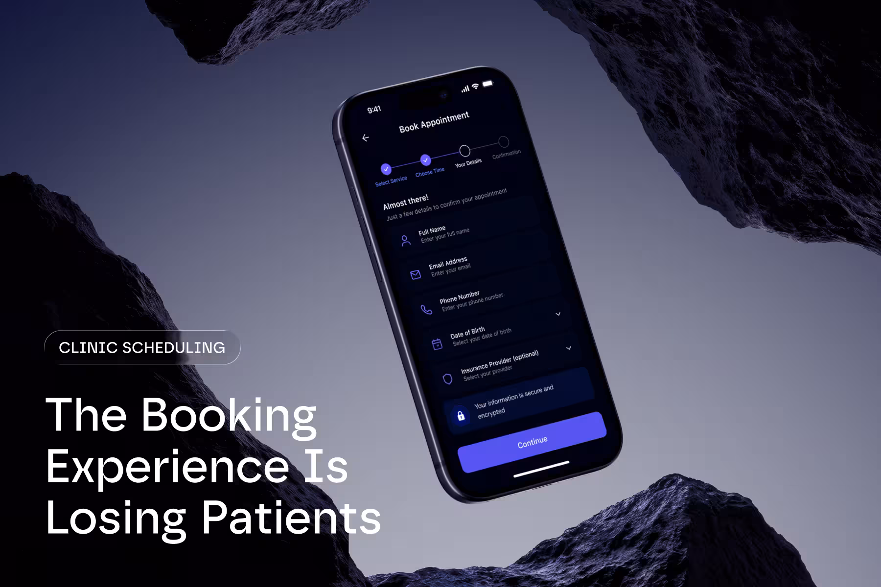
Imaged what patients are often asked to do before they even reach the actual service they want:
- Complete long forms
- Upload documents
- Verify contact details
- Select complex insurance options
- Provide medical history
- Create passwords
- Navigate unclear instructions
You might see this as operational efficiency. But, patients experience it as way too much effort. That disconnect is where you start losing conversion.
The Patient Registration Workflow Is Part of the Patient Experience
As a healthcare provider, you might separate onboarding from UX.
Patients don’t.
To them, the registration flow is the experience.
If onboarding feels stressful or confusing, trust drops immediately. Especially in healthcare.
Patients may already feel:
- Anxious
- Sick
- Distracted
- Overwhelmed
- Unfamiliar with medical terminology
That changes how registration systems should behave.
A healthcare onboarding experience should reduce cognitive load instead of increasing it.
Why Long Registration Forms Hurt Conversion
It might make sense for a clinic to gather everything from the patient upfront.
But, if you go overboard with information collection, you’ll face major friction.
Patients Want Momentum First
The patient’s immediate goal is usually simple:
- Book care
- Contact a doctor
- Secure an appointment
- Access treatment quickly
Long registration flows interrupt that momentum.
Complex forms and excessive input requirements will lead patients out the door before they even walk in. Even studies confirm this.
Healthcare onboarding is even more sensitive because emotional stress levels are higher.
Short vs. Long Registration Forms
We’re not saying you should collect less information permanently. Instead, you should opt for doing that on a progressive basis.
The best onboarding systems separate:
- Essential information
- Secondary information
- Post-booking information
For example:
Instead of requesting full medical history before scheduling, you can:
- Secure the appointment first
- Collect secondary intake later
- Allow profile completion progressively
The experience should mimic a real-life scenario when a patient visits a physical clinic. They don’t spend hours providing information at the front desk, do they?
This will definitely improve conversion potential.
Mobile UX Problems Destroy Registration Completion Rates
A huge percentage of healthcare interactions now happen on mobile devices.
So, why do many healthcare onboarding systems still feel unusable on phones?
Likely because of:
- Endless scrolling
- Tiny input fields
- Broken autofill
- Poor keyboard handling
- Unclear validation errors
- Difficult date selectors
Patients shouldn’t struggle technically while trying to access healthcare.
Mobile Friction Feels Worse in Healthcare
In ecommerce, users may tolerate minor inconveniences.
In healthcare, patience is a much thinner line.
Think about it. The emotional context is different. Patients aren’t casually browsing products. They’re trying to solve health-related issues.
That changes user expectations dramatically.
Reducing Patient Drop-Offs Starts With Simplicity
If you’re overengineering the flow with too many decisions, screens, pathways, and explanations, you’re making one of the biggest onboarding mistakes.
Why? Because when the flow is too cramped, you get cognitive fatigue.
And cognitive fatigue means patients abandoning the flow.
Patients Need Guided Progression
Good healthcare onboarding UX feels linear.
Clear.
Predictable.
The patient should always understand:
- Where they are
- What happens next
- How long the process takes
- Why certain information is needed
Without clarity, hesitation grows. And hesitation reduces conversions.
This is important in digital healthcare products where you must build trust quickly.
Poor Accessibility = Patient Drop-Off
Not every patient experiences onboarding the same way.
What feels "normal" to someone, might feel impossible to another.
This is especially the case for patients with disabilities like:
- Visual impairments
- Cognitive overload
- Motor limitations
- Age-related disabilities
If forms are tough to read, navigate, or complete for those with accessibility issues, they'll simply abandon them.
Make those tiny UX decisions.
Align your patient registration flow with WCAG 2.1 Level AA accessibility requirements.
Do this across all channels, and improve the experience for patients.
By the way, ADA Title II digital accessibility deadlines were extended to April 2027 and April 2028.
Registration UX Challenges Usually Reflect Operational Problems
Onboarding issues aren’t simply design problems. They’re operational in nature, which in turn are exposed through the interface.
For example:
- Disconnected internal systems
- Outdated administrative workflows
- Inconsistent data handling
- Fragmented patient communication
- Unclear intake procedures
The patient registration flow becomes the surface where patients experience those internal inefficiencies directly.
That is why redesigning forms alone rarely solves everything.
Good onboarding UX depends on operational clarity underneath the system.
At Greensighter, we approach healthcare onboarding from both the UX side and the operational workflow side.
Remember this: healthcare systems can’t scale properly when onboarding friction remains unresolved.
Patients Abandon When Trust Signals Are Weak
Healthcare onboarding is deeply tied to trust.
Patients share sensitive information, which creates psychological vulnerability.
If the onboarding flow feels unclear or insecure, patients hesitate then and there.
Weak Trust Signals Create Anxiety
Patients want reassurance around:
- Privacy
- Data handling
- Appointment legitimacy
- Confirmation clarity
- Security
Small UX details heavily influence perceived trustworthiness.
For example:
- Clear progress indicators
- Visible security messaging
- Transparent consent explanations
- Professional interface consistency
- Confirmation messaging
These elements reduce uncertainty to a great extent, especially during registration.
Ignoring Post-Registration UX
Another recurring issue:
The registration ends abruptly.
Patients complete the process, then nothing happens clearly after that.
There's no onboarding guidance, no next-step explanation, no confirmation clarity, no expectation setting.
As soon as that first uncertainty hits, drop-offs increase later in the journey.
The Registration Flow Does Not End at Submission
Patients should immediately understand:
- Whether registration succeeded
- When they will hear back
- How appointments work
- What happens next
- Who to contact if needed
Strong post-registration communication reduces anxiety and improves trust retention.
This includes:
- Confirmation emails
- SMS notifications
- Onboarding instructions
- Patient portal guidance
- Appointment preparation steps
Small improvements, major experience gains.
Best Practices for Onboarding UX
The best healthcare onboarding systems usually share similar principles.
They Minimize Immediate Friction
They only ask for essential information initially. Everything else happens step by step.
They Prioritize Mobile Usability
Forms are designed for real-world mobile behavior, instead of desktop assumptions.
They Reduce Cognitive Load
Instructions stay clear. Choices stay limited, and navigation stays predictable.
They Build Trust Continuously
Patients receive reassurance throughout the process, not only at the end.
They Connect UX With Operations
The front-end experience reflects efficient internal workflows underneath. Nothing is fragmented.
Not Measuring Registration Abandonment Properly
This is another major issue.
Many healthcare businesses track:
- Completed registrations
- Appointment totals
- Cancellations
But they don’t keep their eye on:
- Incomplete registration sessions
- Mobile abandonment points
- Failed form submissions
- Field-level friction
- Onboarding hesitation patterns
If you do this, you won’t fully understand where the conversion loss happens.
Most Conversion Problems Are Invisible Without UX Analysis
Modern analytics tools can reveal:
- Where patients hesitate
- Which fields create abandonment
- Where mobile users struggle
- Which steps create friction
- How long onboarding actually takes
If you don’t have this visibility, you’ll do a sub-par optimization at best and continue repeating the same onboarding problems for years.
If your healthcare platform struggles with onboarding completion or patient drop-offs, book a discovery call with Greensighter to evaluate your registration UX and patient onboarding flow.
The Patient Registration Workflow Directly Impacts Revenue
This is the part many clinics brush aside.
Onboarding UX is an issue that involves both usability and conversion.
Every abandoned patient registration process represents:
- Lost revenue
- Wasted acquisition spend
- Operational inefficiency
- Lower patient retention potential
And because healthcare onboarding often sits between marketing and scheduling, friction adds up across the entire patient journey.
If you want to maintain strong digital growth, remove onboarding friction as aggressively as possible.
Healthcare itself can’t be too simplified; however, access to healthcare can.
Final Thoughts
A strong patient registration workflow should feel almost invisible.
Patients should move through onboarding naturally, without confusion, stress, or unnecessary effort.
Most clinics lose conversions because the onboarding process creates friction at the exact wrong moment, not because patients are rejecting healthcare.
That’s the real danger of poor patient registration process steps.
The best healthcare onboarding systems balance:
- Efficiency
- Patient psychology
- Mobile usability
- Trust building
- Conversion optimization
Losing Patients Before They Even Book?
Nope, it’s not just a UX issue. Your revenue is also impacted.
Every abandoned registration flow represents:
- wasted acquisition spend
- lower patient lifetime value
- operational inefficiency
- missed growth opportunities
And most clinics never realize how much conversion loss happens before appointments even start.
Talk to Greensighter about reducing onboarding friction.
We will help you improve patient conversion rates, and build healthcare experiences patients actually complete.
FAQs
What is a patient registration workflow?
That’s the onboarding process patients complete before accessing healthcare services.
It typically includes:
- Forms
- Identity verification
- Insurance information
- Consent collection
- Onboarding communication.
Why do patients abandon healthcare registration forms?
Patients often leave registration flows because of:
- Long forms
- Poor mobile usability
- Confusing navigation
- Unclear instructions
- Excessive information requests
- Weak trust signals
How does onboarding UX affect clinic conversions?
It directly impacts:
- Patient trust
- Registration completion rates
- Appointment bookings
- Patient retention
- Operational efficiency
What are the biggest patient registration workflow mistakes?
The patient registration workflow mistakes we’ve come across the most include:
- Collecting too much information upfront
- Poor mobile optimization
- Fragmented onboarding flows
- Weak accessibility
- Unclear progress indicators
- Missing confirmation systems
Why does accessibility matter in healthcare onboarding?
Patients with disabilities need access to healthcare onboarding systems.
WCAG 2.1 Level AA compliance helps with this.
It ensures digital healthcare experiences remain usable across different accessibility needs.
Accessibility also affects SEO, legal compliance, and patient trust.
How can clinics reduce patient onboarding friction?
Clinics can reduce onboarding friction by:
- Simplifying forms
- Improving mobile UX
- Using progressive onboarding
- Reducing unnecessary steps
- Improving accessibility
- Creating clearer onboarding flows