


Your clinic is getting traffic. But not the bookings.
Those are not the same problems. And fixing the wrong one is how clinics waste marketing budgets for years.
Most practices respond to low bookings by spending more on ads, pushing harder on SEO, or redesigning the homepage.
The issue is rarely any of those things.
The average healthcare website converts just 3.2% of visitors into inquiries, while top performers hit 21% or higher. The gap isn't visibility. It's what happens after the patient arrives.
Patients are dropping off before they book.
The question is where and why.
The Digital Patient Journey: Where Clinics Actually Lose People
Before you can fix a conversion problem, you need to know where patients are leaving.
The journey from search to booked appointment runs in five stages:
Search → Clinic Website → Service/Doctor Page → Booking Flow → Confirmation
Patients exit at every one of those stages. Most clinics only track the first and the last. Everything in between is a blind spot.
They're not calling. They're not asking a neighbor. They're on their phone, comparing options in real time.
According to recent data, the average patient views 21 provider profiles before selecting a doctor. By the time someone lands on your website, they've already seen your competitors. The bar for keeping their attention isn't high; it's razor-thin.
Your website isn't a brochure. It's the decision point. And most clinic websites are failing at it silently, with no error messages, no bounce alerts, just patients who chose someone else.
Stage 1: The Website Loses Them Before They Read a Word
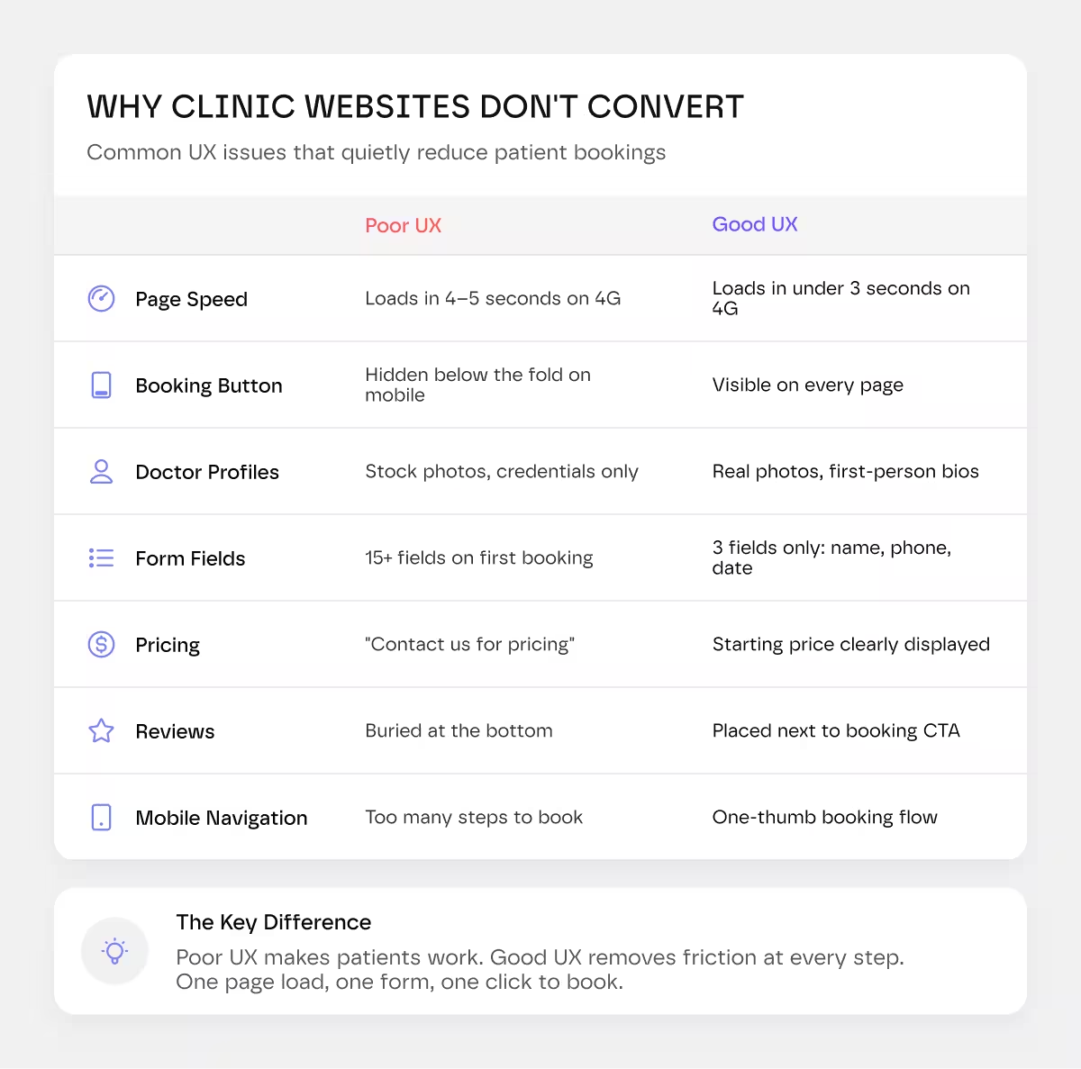
Page speed is the first filter.
As load time increases from one to three seconds, bounce rates jump 32%. That's not a developer concern. That's a booking problem. Every second of lag is a percentage of potential appointments gone before a single word has loaded.
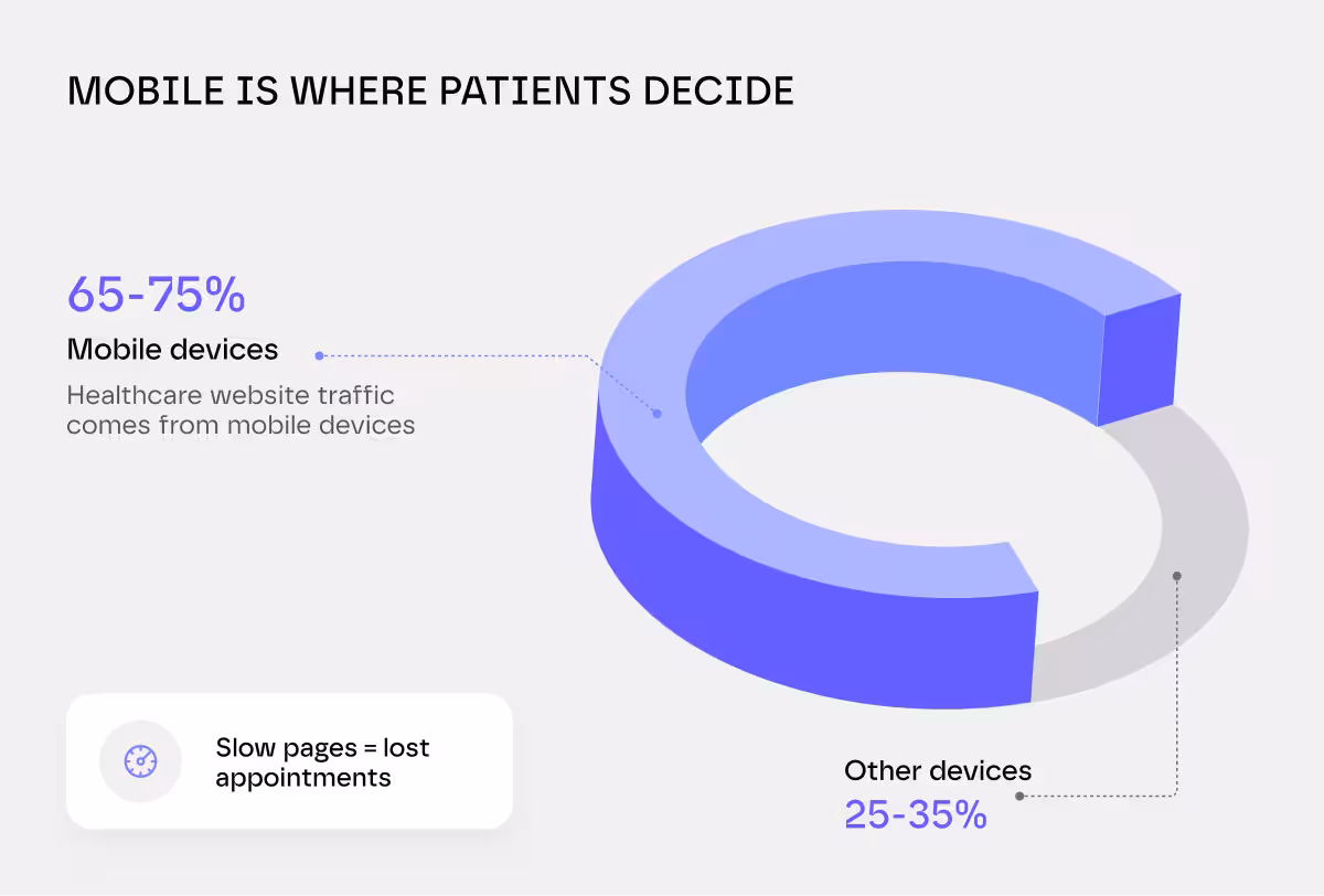
Between 65% and 75% of healthcare website traffic comes from mobile devices. Most clinic websites are built and tested on a desktop. That's a mismatch that quietly kills conversions every day.
Picture a patient sitting in a waiting room, searching for a new GP on their phone. Your page takes four seconds to load. The booking button is somewhere below the fold. They hit back and tap the next result.
That's not a hypothetical.
That's Tuesday.
"Navigation confusion is a significant barrier.
If "New Patients," "Book an Appointment," and "Our Doctors" aren't immediately obvious and one tap away on mobile, you've already created friction for someone who arrived ready to convert.
Stage 2: The Service and Doctor Pages Don't Build Trust
A patient who makes it past the homepage is asking one question: Can I trust these people with my health?
Most clinic service pages don't answer it.
The Doctor bios. A patient who makes it to your provider page is asking one silent question:
Can I trust this person with my health?
Your bio needs to answer that. A list of credentials and degrees reads like a resume, cold, formal, and distant.
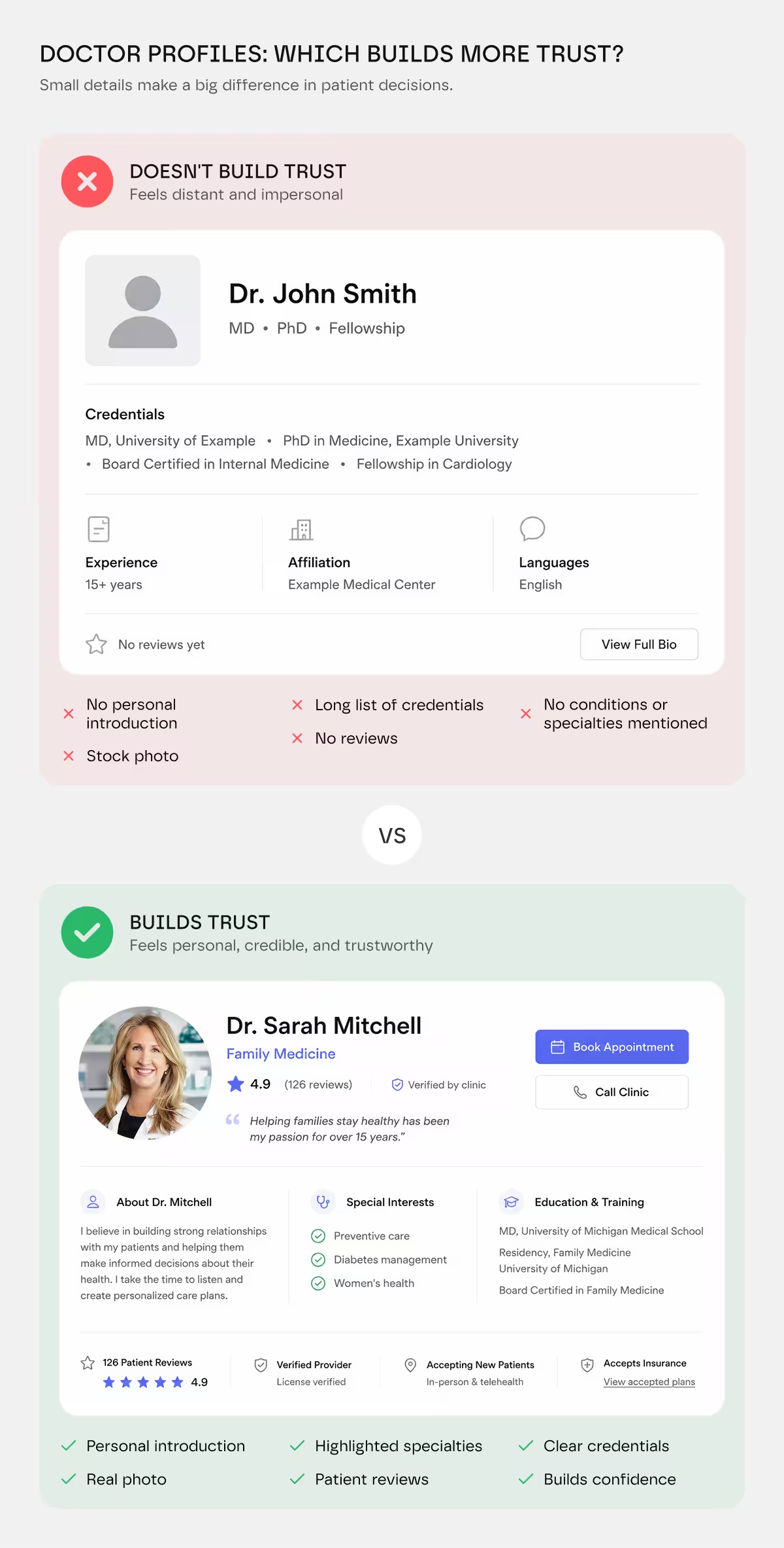
What builds trust is personality.
A real photo.
A bio written in first person that hints at why you became a doctor, how you approach patient care, or what patients consistently appreciate about working with you.
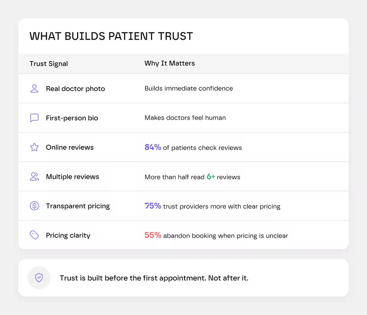
A professional headshot matters more than you'd think. It's the first visual signal of competence and care. Stock photos and outdated pictures signal neglect, that you don't value the first impression. A current, professional photo says: "I take this seriously, and so should you."
Reviews are being checked, whether you manage them or not. 84% of patients check online reviews before choosing a new provider, and more than half read at least six reviews before making a decision.
Reviews buried at the bottom of a page nobody scrolls to or worse, no reviews at all, signal an untrusted practice regardless of the quality of care delivered.
Pricing silence is an underestimated conversion killer. 75% of patients say clear pricing on a provider's website increases their trust, and 55% say they're likely to abandon a booking if pricing is unclear. "Contact us for pricing" is a soft no. It signals friction before the patient has even started.
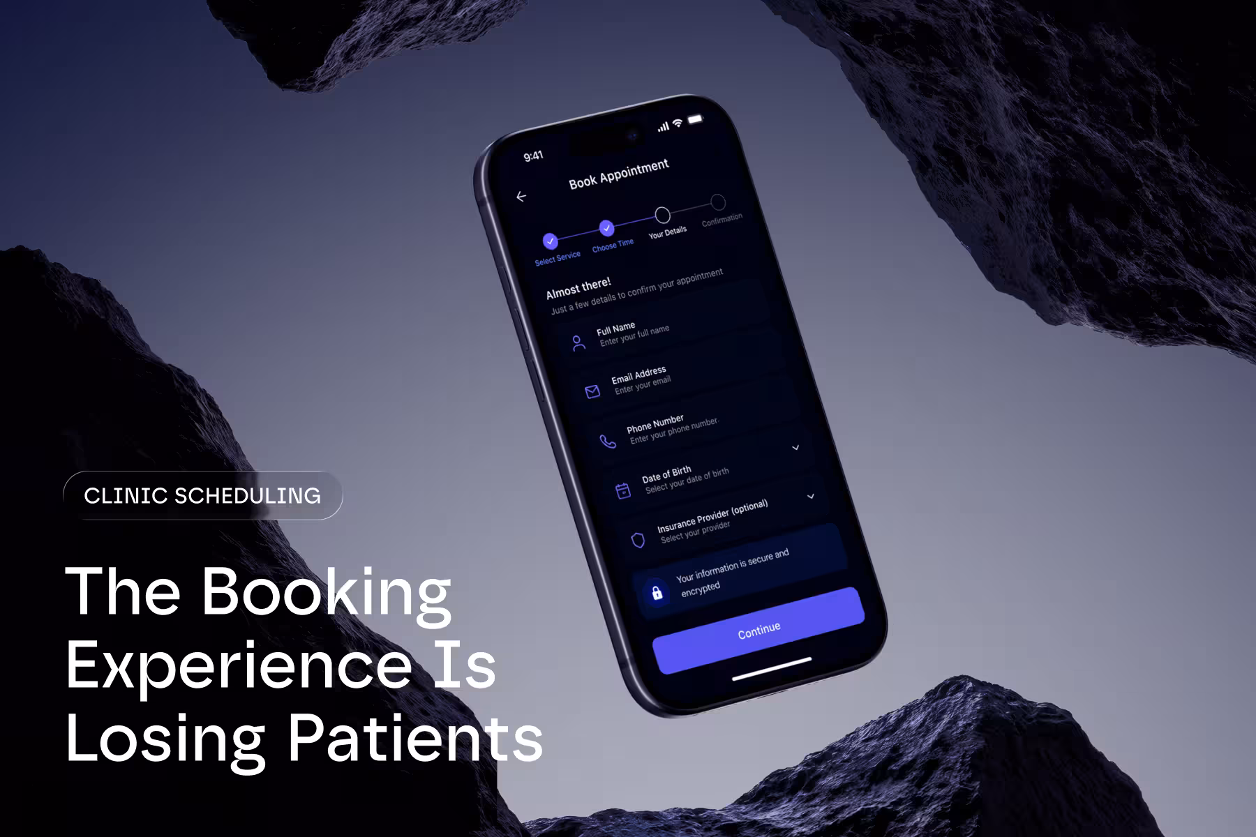
Stage 3: The Booking Flow Is Where Most Clinics Do the Most Damage
This is the stage clinics spend the least time optimizing. It's also where the most bookings die.
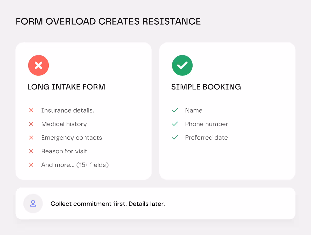
Long forms are a conversion wall. The instinct to collect everything upfront, insurance details, medical history, emergency contacts, reason for visit, makes operational sense in healthcare.
It makes sense only if you want fewer appointments.
Think about what you're actually asking: a patient who hasn't met you yet, hasn't walked into your clinic, and is deciding in real time whether to trust you, and you're presenting them with a form that looks like a tax return.
Ask for the minimum.
Name, phone number, preferred date. Collect the rest after they've committed to the appointment.
Stage 4: The Phone Line Nobody Answers
Patients who call have already decided to trust you.
But if your phone system drops calls, routes them to voicemail, or creates long waits, you've lost them.
Most clinics treat phone systems like overhead. They're not. They're conversion tools.
Your system needs to answer immediately. Route calls to available staff. Log every interaction. Connect to your scheduling system so staff can book without transferring.
When a patient calls and reaches a real person who books their appointment in real time, that's conversion.
Most clinics can't do this. Separate phone. Separate scheduling. No connection between them.
That's a technology problem.
What Good Healthcare Website UX Actually Looks Like
Most "best practice" UX advice could apply to any industry. Healthcare has specific requirements that general guidance misses.
A high-converting clinic website does these things specifically:
- The booking button appears on every page. Not just the homepage, not just the contact page. Every page.
- Doctor profiles include a photo that looks like a real person, a bio written in first or second person, and a list of conditions or patient types they commonly treat.
- Reviews appear near the booking CTA, not at the bottom of an "About Us" page. The patient is making a trust decision at the moment they're about to commit, not before.
- Insurance information is visible without having to call. If you accept the three most common insurers in your area, say so prominently.
- The booking flow works completely on a phone with one thumb. No pinching, no zooming, no fields that require a desktop keyboard to complete efficiently.
- Load time on a 4G mobile connection is under three seconds. Not on office WiFi. On 4G.
What best practice does not look like: A long homepage with a hero image, three service cards, a "Why Choose Us" section, and a footer with a phone number. That's a brochure. It answers no questions a patient actually has at the moment they're deciding.
The Systems Problem Underneath the UX Problem
Here's what most conversion advice misses entirely: many of these issues aren't design problems. They're system problems.
A booking button that doesn't sync with your scheduling software creates double-bookings.
A patient portal that requires a separate login from your booking flow creates a drop-off before the first appointment is confirmed.
44% of patients say they've had to repeat information because systems weren't connected, and 52% say a unified digital system would increase their loyalty and likelihood to refer others.
Clinics that consistently increase patient bookings online aren't just better at design. They've connected their patient-facing tools to the systems underneath- scheduling, intake, and reminders. So the journey from first click to confirmed appointment has no dead ends.
You can fix the button text. You can compress the images. But if your booking tool, EHR, and patient communications are running in disconnected silos, patients will keep hitting walls you can't see from the front end.
That's not a marketing problem. That's a technology integration
The Fixes (In Their Priority Order)
If you're a clinic owner trying to figure out how to get more patients from your clinic online, start here:
- Test your mobile booking flow today. Open your site on your phone, start a booking, and time it. If it's over 60 seconds or requires more than five taps, that's your first fix.
- Cut your form fields. Three is the target. Name, phone, preferred date. Everything else comes after confirmation.
- Put real doctor photos and bios above the fold on every provider page. Not stock imagery. Not a credential list. A real person with a real bio.
- Add reviews near your booking CTA. Not at the bottom of the page, next to the button a patient is about to click.
- Publish a starting price for your most common services. A range is enough. Transparency converts.
- Track your phone answer rate during peak hours. If calls are going unanswered, fix that before any digital optimization.
- Audit your systems integration. If booking, scheduling, and intake aren't connected, patients feel it, even if they can't name why.
Some of you might be wondering, “How to find problems in your website?”
You can't fix what you can't see.
Most clinics redesign based on guesses, "patients probably want this," or "our homepage looks outdated."
That's backwards.
Start with data. Set up tracking tools that show you exactly what's happening:
Google Analytics 4 shows you where patients are dropping off. Which pages do they visit? Which ones do they leave from?
Heatmap tools like Clarity or Hotjar show you where people click, scroll, and rage-quit. You see the friction points visually.
Form analytics show you which fields cause abandonment. At what point do people leave?
Call tracking shows you how many phone calls you're getting, which ones convert, and which ones are missed.
Most clinics skip this and jump straight to redesign. We audit first. We find the real problems. Then we fix them.
Does it feel like too much work? We audit clinic booking flows, identify where patients drop off, and fix integration gaps that break your conversions.


.avif)